
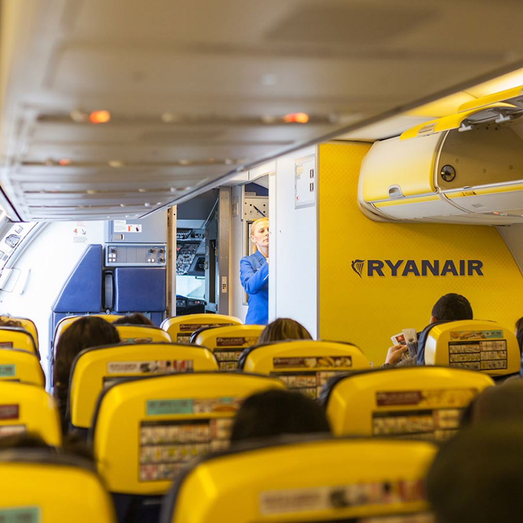
Colours: Yellow
Once upon a time a very straight-talking individual decided he wanted all the interiors of his budget airline planes to be very ‘on-brand’. Unfortunately, the side-effect of that decision was each plane interior had to be liberally plastered in a very in-you-face tone of yellow by a possibly-cringing-as-they-did-it graphic designer/interior designer.
Why unfortunately? Well, outside of whether you like the colour or not, yellow has some psychological effects that may not be the best idea in a cramped and often emotionally pressured environment.
In graphic design, colour is one of the tools we use to nudge people to react to the visual communication we’re producing. Yellow is an emotional colour, in fact it can promote feelings of optimism, confidence, self-esteem and more. However, there is a different side to the colour, one that promotes irrationality, fear, emotional fragility, depression, and anxiety.
Who knows if that conversation about the impact of particular colours on people was ever had at board level? But let’s be honest, in these busy times with some people seemingly more socially fragile and maybe emotionally quicker to react in more extreme ways, it may not have been the wisest choice.
When Yellow is Not Mellow
So why is yellow not so good in this setting? Any designer will explain that the yellow wavelength is quite long and therefore it’s firmly at the stimulating end of the spectrum. The right yellow can indeed lift our spirits—it is in many ways the colour of confidence and optimism. But, too much of it, or (and this is pretty important) the wrong tone in relation to the other tones in a chosen colour scheme, can cause self-esteem to drop, thereby giving rise to emotions such as fear and anxiety.
For example, you never, ever use a bright yellow in a room where you may have difficult meetings, talk about sensitive issues, or any space where you may need to be more diplomatic.
Looking at the new Ryanair colour scheme would seem to indicate they’ve now balanced the colours much better than in the past. Their past schemes were busy and the yellow was hugely dominant.
However, with the new scheme (which I think is so much better) they’re still on-brand but they’ve also (consciously or not) potentially reduced the negative effects of such a dominant use of the colour yellow.
If, and it’s probably a long shot, you enjoyed this article, you may like another of ours on The Power of Colour.
If you’d like to chat about design and how it can benefit your business, contact us, we’d love to chat.
Jeff