
Hierarchy In Design – And How You Can Use It
There are 100’s of great principles behind the craft of graphic design. We often talk to anyone who will listen, that design is more objective than the majority think. We’re not just painting pictures, but helping to communicate effectively to a viewer. The better that experience, the better the engagement with your message. This is where hierarchy in design comes in.
We’ll regularly point out design is not art, rather it’s an answer to a specific challenge, problem, goal that an organisation may have in order to communicate effectively though a visual medium—print or web for example.
While many of those principles take years to truly understand and practice, there are many that, once we recognise them, we can all use.
If you’re trying to layout a basic leaflet on Canva and wondering why it just doesn’t look right, or need to know when a design you’ve been presented with actually looks good and will be effective, then an understanding of the underlying principles will go a long way to help.
While I was giving a presentation at a Cardiff networking event with the FSB we covered a range of these principles to look out for. We’ll post more over time, but for now I’d like to cover hierarchy in design.
A dictionary definition of hierarchy is: “ a system of organizing people into different ranks or levels of importance, for example in society or in a company.”
Well, we can do that with visual elements on a page too. Everything you read or see will have some form of visual hierarchy applied. We look, for example, at headings first, then subheadings and so forth.
But, what influences our eyes to understand what should be read or viewed first?
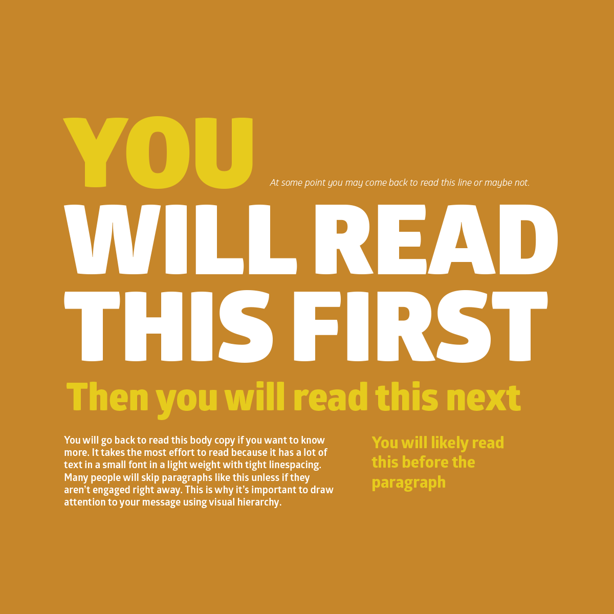
As you can see in the main image that accompanies this blog (one that’s pretty common online), we can use a number of elements to do this.
Typeface/Font Weight
The visual weight that a typeface has will help draw the eye. A thin typeface may not grab the attention if there are other weighty elements or bright colours on the page, so in these instances we may choose to use a more ‘bold’ style of typeface.
Colour
Colour can be quite difficult to get correct in this instance; we’re looking to create contrast here. As shown in the example, by making the main heading a bright white it clearly stands out even against a fairly punchyx bright blue tone used on some other text.
Size and Scale
Clearly one of the simplest ideas to grasp is to just make the thing you want to stand out bigger. But again, it needs to be weighed against other elements. But a nice clear set of sized headings will really help your document break up into more manageable sections (a hefty Word document for example). But this applies to images also, ensure that there are clear distinctions in sizing of all elements on a design to help the viewer be led through the information.
Position (Perspective and Space)
How you position elements will also affect how the eye tracks the message you want to communicate. Generally, we read in a Z pattern (and also an F pattern). So, place important information top left or centrally to grab attention. Other ways we control the hierarchy is through perspective and overlapping. Perspective can push back some elements while bringing others to the fore. Overlapping elements can help a viewer be led through a document or advert.
There are other aspects we can look at another time, and loads of design blogs out there to help, so do some digging and enjoy finding out a little more.
–
In a nutshell, the careful use of hierarchy in design helps add structure, create visual organisation, create direction, add emphasis, and overall helps a viewer navigate and digest information easily.
Jeff
Caffeine Creative are based near Cardiff and can help with graphic design, web development, company values, branding and more.