
I Could Have Done That!
Or… complexity for the sake of complexity?
Brand development must be one of the most exciting projects both for a client and the designer. The responsibility to get it right, to interpret the brand’s personality, values and understand the market, the organisations goals, to ensure usability in different settings, and more is a challenge—an exciting and hugely rewarding one.
However, recently I came across some comments from a few individuals who said: “I could have done that!”, to their designer.
When they say that, what do they mean? After a little investigation, it comes out that some feel simplicity in a logo shows it’s somehow worth less than a more complicated offering.
This seems to stem from perhaps a lack of understanding of what branding really is, and in this case the brand logo. They are seeing only the craft of drawing the shape itself. So, if it’s simple, then it must be in their eyes, cheap, or close to valueless.
I don’t need to tell anyone in the industry that this is a mistake. Yes, sometimes simplifying a logo is not the right thing to do, it can occasionally lead to a lack of character, lack of individuality, and give off the wrong vibe for the market the company or organisation is in.
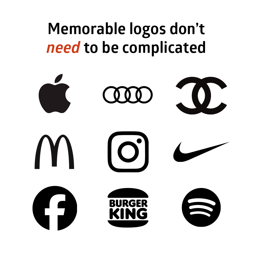
However, a quick but critical look around at existing brands clearly highlights that simplicity is often a very powerful tool. In fact, the truth is that very often simplicity can lead to greater memorability. Yes, at times a simpler approach can offer an advantage in brand recognition. After all, close your eyes and see the Apple or Audi logo, now try that with Harley Davidson, not quite so easy is it.
But we’re still missing a vital element that sits behind brand and logo development. That missing element is the huge amount of understanding of: the market, the brand personality, the values, the needs and goals, research into competitors approaches and colours, and a lot more.
With a firm grasp of this background data and detail, only then are you prepared to really begin to conceptualise and then design a logo. And if simplicity is the direction driven by the collected research, then that’s no bad thing.
To simply look at a design and infer anyone could draw it is to misunderstand the purpose of a logo. It’s there to engage and be memorable, and reinforce some aspect of the brands mission or values. So maybe anyone could draw it, but you know what, they didn’t! The designer did though, and they based it on all that research hopefully. And when it’s done properly, it will really mean something and be a powerful tool in the visual comms toolbox, not to mention something to be deeply proud of and drive onwards from.
And if you’re still not sure, and feel logos need to be super complex to justify the cost, take a look at some of the designs here and in the opening image of this blog. Each is beautifully simple, instantly recognisable – yes, some of that may be down to pervasiveness in our conscious due to monster marketing budgets or simply time served by the logo, but, if you could, are you really going to go up to the designer of Coco Chanel and tell them “I could have done that!”


Do You Value Great Design?
To chat to us about design or branding for your business or organisation, please head over to our contact page… we’d love to discuss your needs and how well crafted brands and designs can make a difference to your business or organisation. Improve your response, get more eyes on your brand, communicate your message better…
Jeff