Designing With Purpose
One belief we’ve always held close to our heart at Caffeine is that design must not only look good, but primarily it must, no—let’s word that in a stronger term—it absolutely must have… purpose. Without purpose, design becomes art. And let’s face it, that’s not what businesses generally want to pay for, the reality is they want to further their brand and make money. So, what happens when a piece seems to not have any purpose?
Recently I’d decided to swear off low cost t-shirts. They never last and feel cheap when you wear them. I wasn’t ready to pay Reiss prices (though their T-shirts have a lovely quality feel to them), instead I settled on a couple of t-shirts from Fat Face. The material was soft, 100% organically grown (and if they wash like previous purchases) will last a good time without shrinking or getting out of shape. Plus, they were a good price/value balance—I hope…
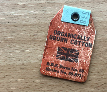
One of the obligatory swing tags on the garment was styled in the pretty standard FatFace way and told me a useful piece of information, that the piece was made from 100% organically grown cotton.
One belief we’ve always held close to our heart at Caffeine is that design must not only look good, but primarily it must, no—let’s word that in a stronger term—it absolutely must have… purpose.
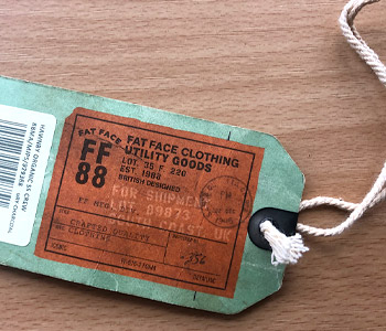
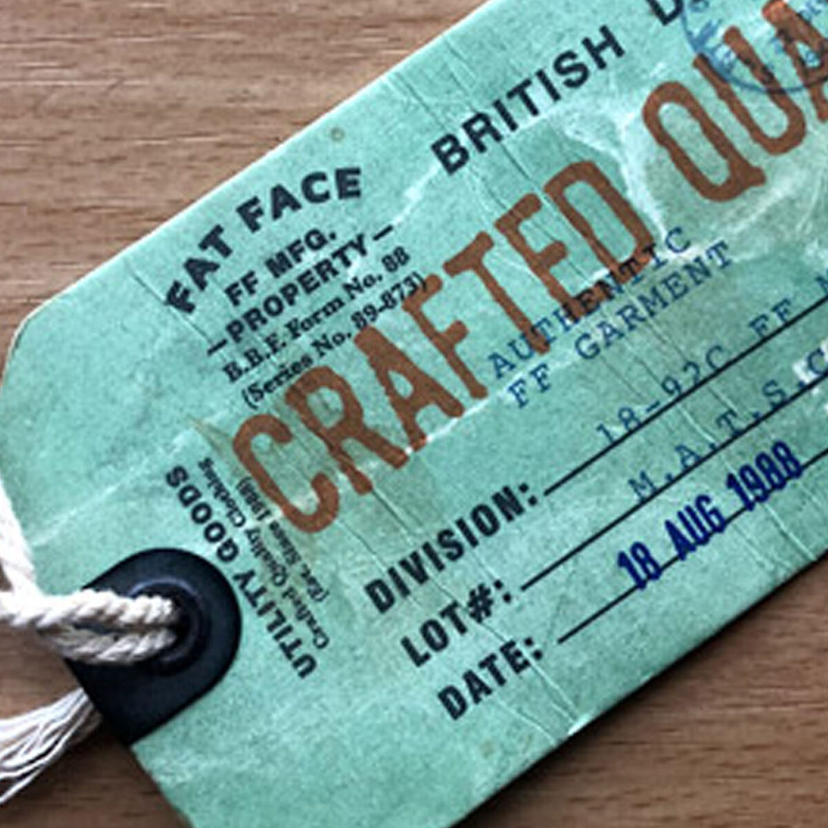
However, the Other Tag…
Posing as a quality control tag, this piece of ‘design’ carried the price and bar code, along with their URL, and confirmation of British Design. All fine so far, but in an effort to apply a style to it, they decided to pretend it was a quality control document.
Included were faux titles like: Division, Lot#, Date, Inspection by, Style and so forth. And then next to those headings: made up codes, abbreviations and dates. Certainly nothing that was actually relevant to a quality control tag.
OK, so we all know this for what it is, and does it actually matter? Possibly not. But what it was, was a wasted opportunity to bring their brand to life and to engender some feelings that had some depth. This tag, was instead, shallow and ultimately pointless (take a look at the images and see what you think). So, what would we do…
To start, we’d look at the cost of the tag and decide what we’d need to put on that tag to justify its existence and its cost on the garment.
Then, we’d think about what goal or purpose we’d like the tag to have, and that doesn’t have to be anything more than simple branding of course. But surely, the tag could reinforce the brand and bring something of use to the consumer. For example, we could add something of value that the brand would like to get across to the consumer. We could use the space to make the consumer feel something, to make them believe they have bought a carefully constructed garment perhaps. Or suggest ways for them to engage with the brand though social media. By talking to your customers in this way you are creating valuable touch points.
I know what Fat Face have tried to achieve here is to communicate some element of the brand value (the vintage vibe that engenders a feeling of quality and trust), but instead they’ve come off looking a little shallow and low-end really. High street brands really need to be thinking of how they are going to fight against the online retailer, and I’m not sure using design in this way will help anyone.
It’s a shame as these are not the values I would automatically ascribe to Fat Face.
Jeff
For more information about Caffeine Creative or the work we can produce for you, please contact us for a chat, we’d love to chat about design.