Case Study: Laguna Spa
The Company
Part of the Park Plaza Hotel in Cardiff, the Laguna Spa is a city centre spa with a customer centric approach to their clients. Each client enjoys a particularly carefully planned journey through their chosen spa package.
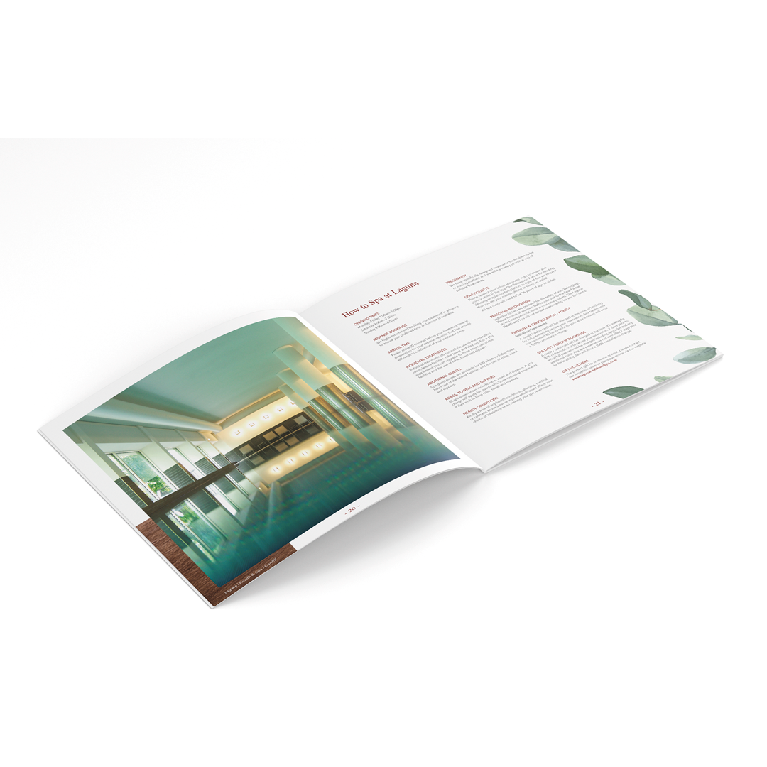
The spa specialises in their range of treatments and offer a beautiful pool and relaxation area with a lovely green view of mature trees out of the windows of the relaxation room—even though they are right in the heart of the capital city.
“Each client enjoys a particularly carefully planned journey…”
The Task
Laguna Spa were looking for a full review of their brand values and how this could translate into new marketing collateral. Initially, the logo itself was to remain the same, though colours were a possible change.
Previous agencies had not provided the solutions the spa was looking for, so we realised we needed to go a little deeper than normal for the brand project.
This meant not only ensuring the client had full input at the start of the project—isolating the existing values and goals for the spa—but looking at the project more holistically. That meant looking at the interior space itself as a guide to the design of future brochures, website, leaflets etc (each to be updated as they are required).
The Challenge
Laguna Spa understood themselves well and were able to articulate the positioning of the spa well. This focussed our efforts quickly into three distinct areas—each representing the values in three related but still specific styles.
We returned with a full presentation of not only the values, but visuals of how these values could translate into an interior design, along with how they would influence the design of brochures for example.
These three ‘looks’ were categories as:
- The architectural style of Inside Out/Outside In (where the outside and inside are blended and blurred. In this version we concentrated on nature mixed with urban materials)
- The minimalist Japanese approach of Shibusa (simple, subtle, and unobtrusive. Characterised by natural materials and bold but minimalist use of colour).
- And finally, a more typical approach of Rainforest/South American (bold rainforest imagery and natural materials but with rich gold and bold colours and Latin inspired patterns.
We then created a full presentation that included colourways, textures, furniture, interiors, accessories, patterns and colours that exemplified each approach. We also produced three draft cover treatments for a brochure to visualise how each approach would translate to a printed document.
Further, we built on the idea of creating an ‘Instagram corner’ to provide a perfect social media space for certain clients and help popularise the spa.
The Outcome
At the end of the presentation to the client we received a lovely piece of feedback from the Sales & Marketing Director: “That’s the best presentation I’ve ever seen”.
Our presentation helped the team at Laguna understand our thoughts and how the values of the brand translate into meaningful decisions.
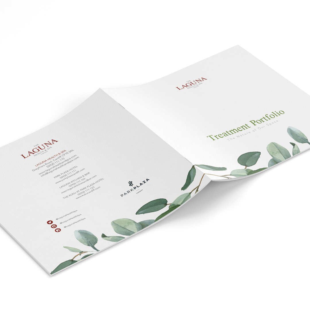
Finally, though we’d been told not to touch the logo, well, we had to… We presented 24 typeface variations with a new design. The client loved them and changed their mind on not allowing us to alter the logo. The new logo captures a more modern aesthetic and gives a more elegant feeling to the spa.
We are now rolling out new brochures, posters, leafleting for Laguna, and our remit has extended into the Park Plaza hotel itself. We now produce menus, room brochures and more for this 4-star hotel.
See more of our branding work on our branding portfolio page.
“Caffeine Creative have helped us achieve our branding visons in not only a timely manner but with a real passion for what they do. From the smaller work to the large projects, they always give us the same professional commitment to each piece.”
Caroline Sims, Sales & Marketing Director – Laguna Spa, Park Plaza Hotel Cardiff