Case Study: Barnardo’s
The Organisation
Barnardo’s are a third sector organisation that needs no introduction. They came to us frustrated at their existing external designer. We looked at the original brief that was given to the incumbent agency and we laid out a selection of options to get them to their goal.
That was 6 years ago. Since then we’ve created a huge range of publications and supporting materials for the Welsh arm of this well respected national charity.
The Task
Once we’d proved ourselves with the initial project, we soon began to create multiple large publications (toolkits), along with posters, animations, invites, poetry books and more, for several of the sectors/projects within the organisation.
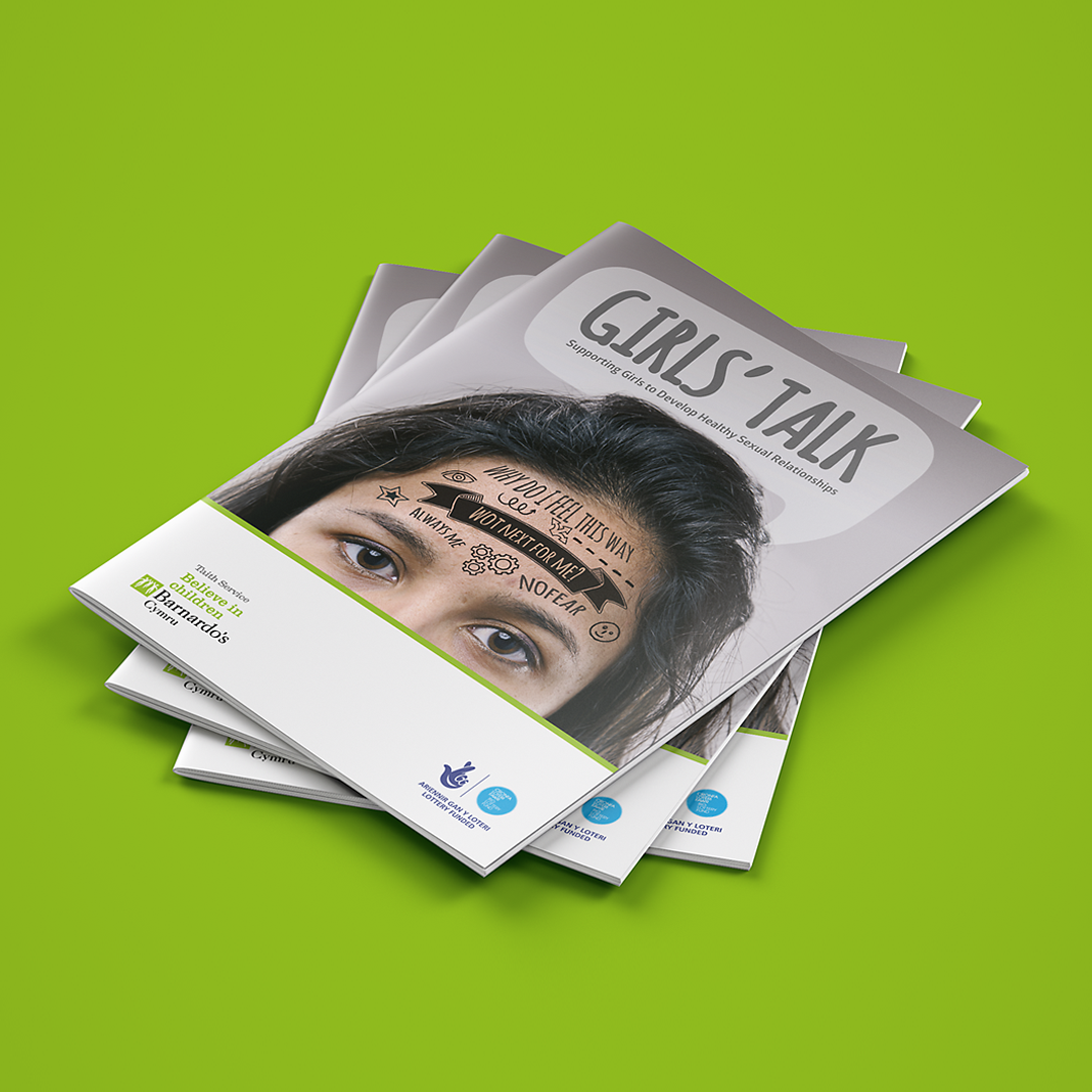
The images on this page are from one of those projects, “Girl’s Talk”. The Girls’ Research Project was a three-year project funded by the Big Lottery. The purpose of the project was to develop standardised assessment tools and intervention resources for girls who have engaged in harmful sexual behaviour.
It was designed to be used by professionals supporting girls who engage in concerning or harmful sexual behaviours in order to reduce risk and allow them to move toward healthy adult relationships.
The Challenge
The first challenge was ensuring the publication would be picked up and used. It had to be both easy to use and eye-catching, but always mindful of its sensitive content. Further, it needed to appeal to both the adult professionals who would deliver the content, but also feel approachable by the younger users too.
The tool kit content was of course provided in a most professional way by the experts at Barnardo’s Cymru. Our task was then to add creative concepts to that content and in a nutshell help ensure it was used.
The Outcome
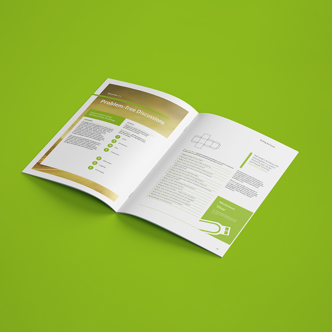
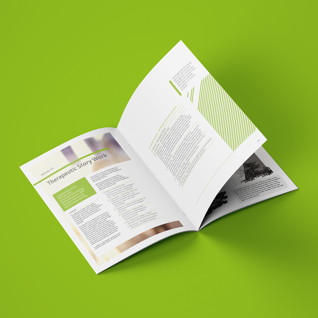
Through initial meetings we brought a range of new ideas to the discussion that included a short ‘graphic novel’ approach to a story the team at Barnardo’s had already developed. Further ideas included a board game, separate printable worksheets, and providing the tool kit in a range of formats so it could be distributed in many ways.
Our design was clear, modern, followed the current brand guidelines, and brought a more cohesive feel to the work.
We ensured the content was logically presented, was supported by simple navigation tools, and included a set of icons and standardised call-outs. We ensured any additional content (such as that located on the supplied USB stick and on the government website) was clearly labelled and accessible from the master document—so the professionals could get on with their work with the minimum of hassle.
The entire process was met with a hugely positive response from the team at Barnardo’s. We all worked together closely to ensure the final work was really practical, eminently useful and hit all the relevant deadlines.
The response by users and stakeholders was massively positive; this was our goal and we achieved it. We are immensely proud of the work we do with Barnardo’s Cymru.
See more of the work on our Portfolio page.
“I think this is great, you are stars, it looks fantastic.”
Sharron – Barnardo’s