
The Power of Colour
We are surrounded with colour. What is the power of colour? Every day our lives are enhanced by the colours of nature around us. We have imitated and can now produce colour like never before, in fashion, on the printed page, online and so much more.
This ubiquity can, though, lead to us not thinking about how colour makes us feel and react.
As a designer I know colour is a powerful tool, and the understanding of how we use this tool is getting richer all the time. From the slightly hit-and-miss “science’ of colour psychology to new research on the neuroscience of colour, our understanding is becoming deeper and that’s deeply useful to designers and marketeers.
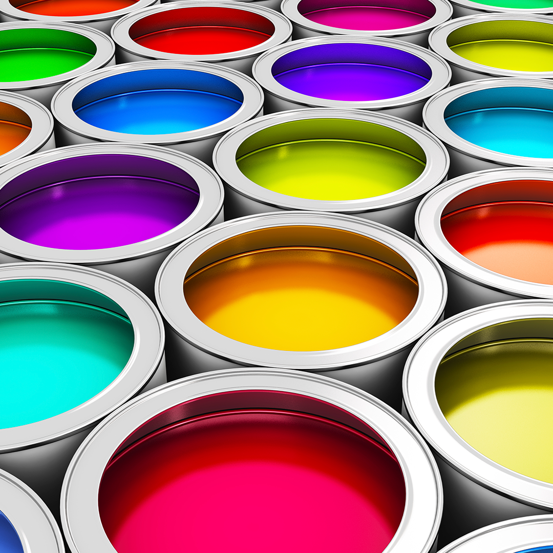
From the earth tones of ochre and it’s importance in aboriginal art and culture, the stunning depth of lapiz lazuli mined in Afganistan, and amazing tones such as Indian yellow, we’ve been driven to all corners of the earth to ensure we can reproduce bright, vivid, deep powerful colour in our arts—to communicate and drive an emotional reaction.
We know on a profoundly human level that the power of colour moves us. Now we are beginning to understand how this occurs. In a new article on colour, neuroscientist Bevil Conway highlights how we can grasp this biological reaction to colour and perhaps use it to our advantage.
“As a designer I know colour is a powerful tool…”
Colour and Language

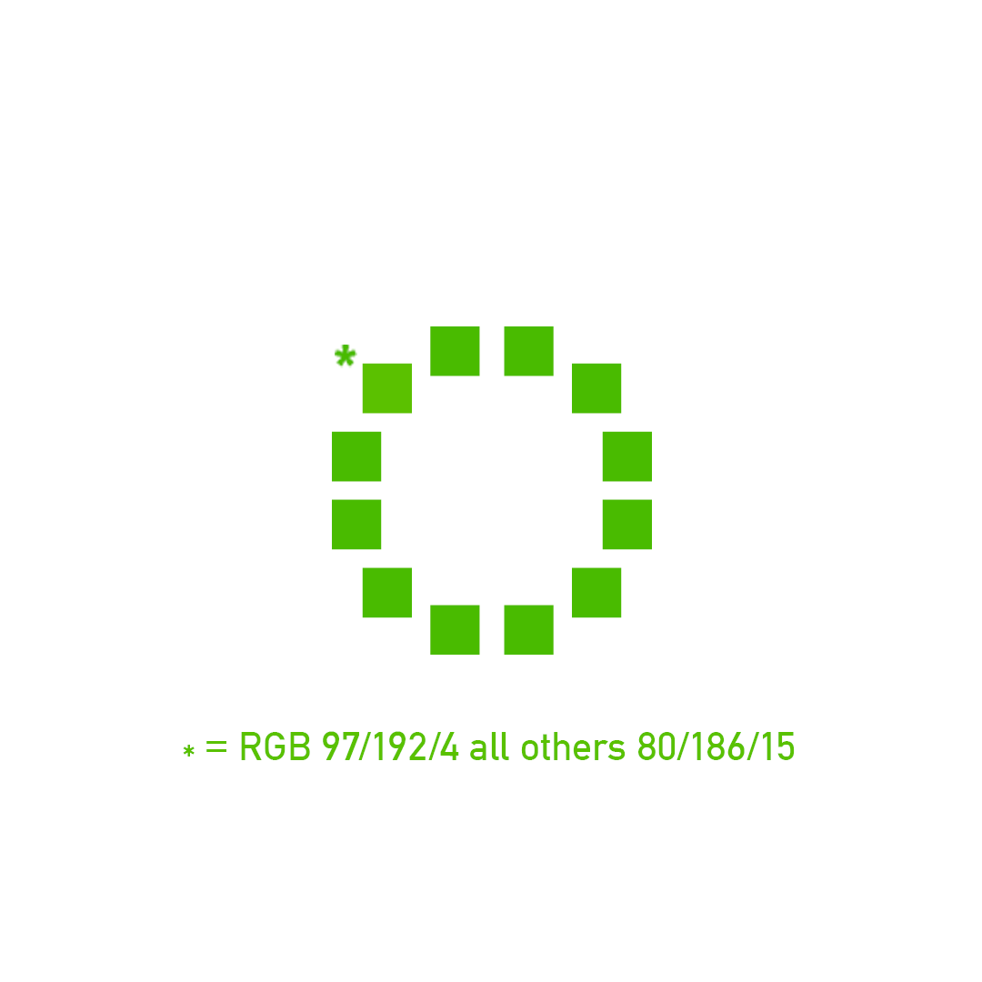
Colour perception also appears to be tied in to the language we speak. You may have seen this before, but take a look at the ring of green squares at the beginning of this article, which one is different? All the same right?
Not quite… The Himba of northern Namibia categorise colour differently than those who speak English. They can spot the different colour square almost immediately. At the end of this article is the same image with the colour values added. Once you know which square is different, you begin to see it.
So how can the Himba see it and we struggle? Different languages have differing numbers of basic colour terms. English has 11 such terms and Himba has five, so each Himba term covers a broader range of colours. It just so happens that the Himba spot this particular ‘cross-over’ point between the colours in a different way to us due precisely to the fewer categories in their language.
In other examples, it seems the colour that for Himba speakers is categorised as “serandu” would be categorised in English as red, orange and pink. Also, the Himba come to use one word, “zoozu,” to embrace a broad collection of darker colours that English speakers would refer to as dark green, dark blue, dark brown, dark red, dark purple, and black.
This ring of colour experiment was played out in reverse. English speaking people could spot the difference immediately (including me I’m relieved to add), but the Himba simply couldn’t see it. It was amazing to see someone not see a colour that was just so obviously “there” to me.
Let’s Think More About Colour
Colour is linked to our emotions, our language and our drives. With that in mind we’ll take a look at different colours over the next months in this blog—how they effect us and the decisions we make because of them. That’s the power of colour.
Who knows, it could help you make a positive difference to your next campaign. Why not chat to us about design and how we can help your business benefit from great design.
Jeff