
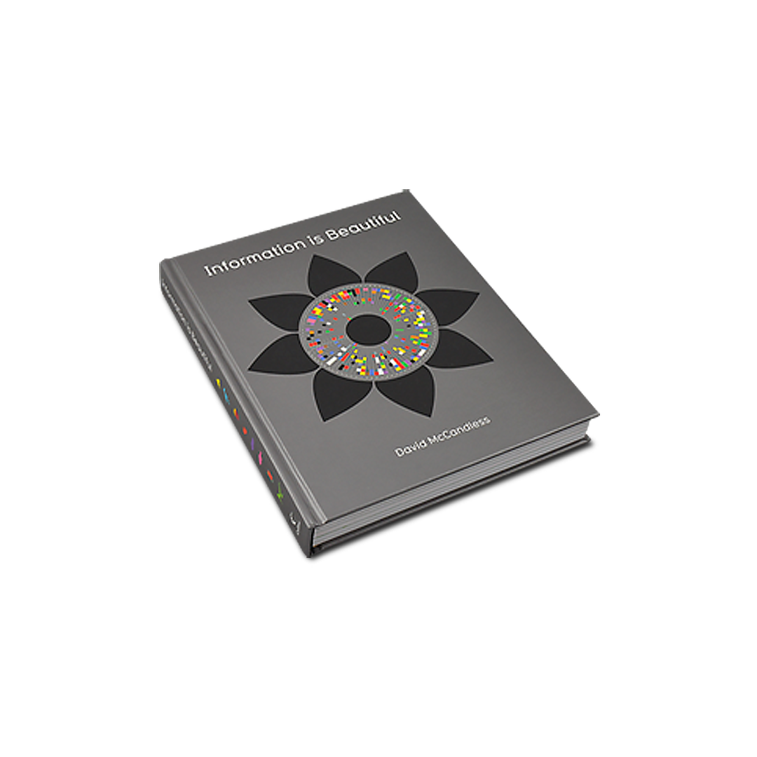
Information Is Beautiful
Truth be told, I’m not a massive fan of books about graphic design.
Yes, I’ve read quite a few, but they’re sometimes a little myopic. I prefer to get my design influences from other sources beyond my immediate field. That’s not to say I ignore the world of Graphic Design with its historical and changing styles, that would be foolish. However, I have in my hand a great example of how I can have a great book (and I do love books) and feed my desire to look at things differently.
In his book Information is Beautiful, David McCandless sets out to produce a book with as little text as possible but crammed with visual information. He has decided to experiment with visualising large amounts of data that we don’t often appreciate simply because of its presentation.
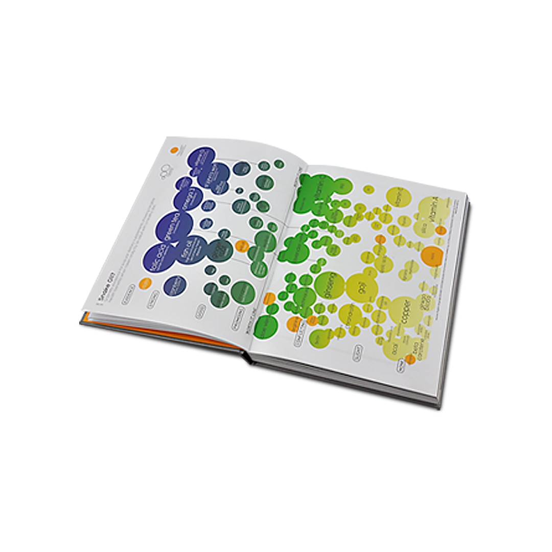
So here you won’t find simple graphs, but some of the best examples of why visual design matters to your business, organisation, or to you personally. Enter, the Infographic.
Much caught my eye, the Evolution of The Personal Computer was a trip down memory lane. But it was the simple, yet brutal graphics of carbon usage and non-renewable resources that have really stuck with me.
David has managed to explain quickly, simply, and effectively the misunderstanding many of us have over our carbon footprints; that a large car emits less CO2 in a year than the average American does in the same period, as indeed does a 250 guest wedding. And, within a renewables infographic, that we only have an estimated 10 years left of Zinc deposits, 23 of Tin, and 13 years of Indium (used to make solar panels, amongst other things).
These two examples don’t even scratch the surface of the wealth and depth of this lovely book.
And they’re not all serious, some are lighthearted such as comparing the IQs of various people (Sharon Stone coming out above Stephen Hawkins?), or quirky in the case of the Dictator’s Wives graphic.
“why visual design matters to your business”
Of course, it’s not perfect. The sources of information can be a little flaky at times, a few details are incorrect or missing, and the graphics never quite reach the heights of beauty that I have seen elsewhere in the infographic world. But I don’t believe that was the aim of the book. This book aims to show you that presentation of information can be more meaningful when delivered through creative, graphical means. And when you consider that every one of these designs was done by one man, you understand the task the author set before himself, and on these levels he has delivered.
Of course here I am espousing the virtues of a graphic medium through the use of words, so I think it’s time to hand over to some images from the book, hopefully you’ll enjoy them as much as I did. It’s a highly recommended read…er…look.
If you’d like to chat to us about design, infographics and more, please drop us a line via our Contact Page…
Jeff
Published by HarperCollins ISBN 978-0-00-729466-4