
Case Study: Andrew Forbes
The Company
Case Study: Andrew Forbes. Andrew Forbes are an established and highly respected chartered surveyor with multiple offices in South Wales, the West, and M4 Corridor. They have a particular eye for detail, keen understanding of customer relationships, and a very personable approach.
The Task
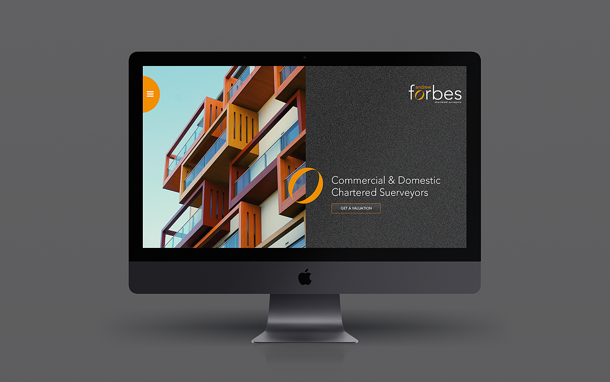
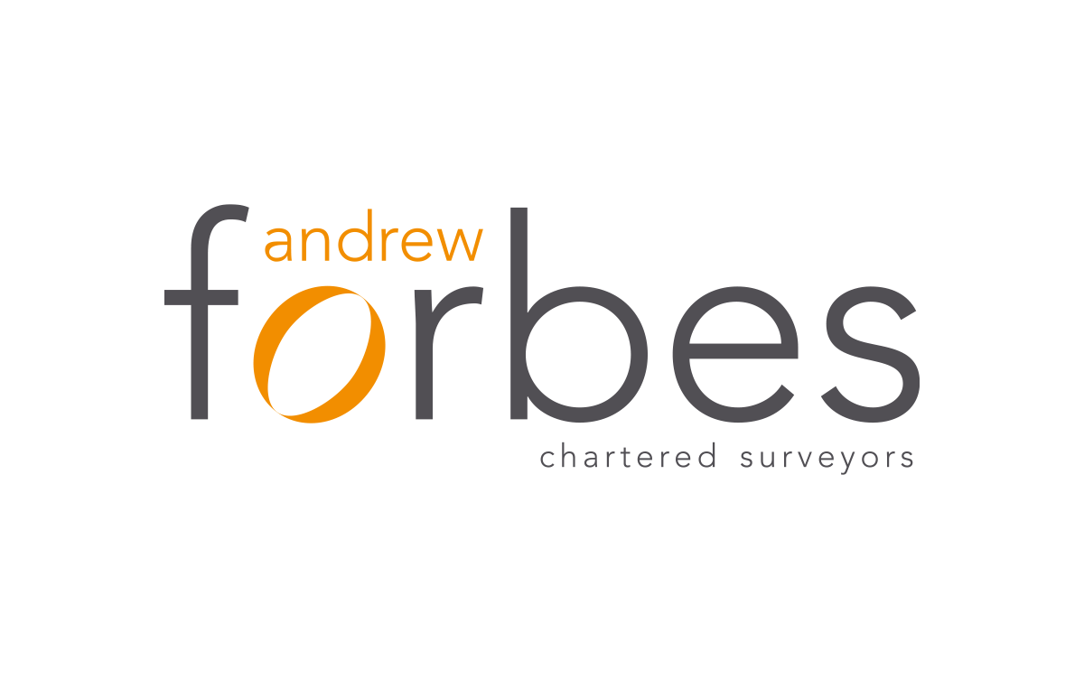
We were approached to look at reinvigorating the brand as a whole, starting with the main element of logo and then all the important supporting pieces. Further, we were asked how we’d then extend that out into printed materials and their website (which is currently in development).
We started the project about 6 months ago, but as we always need to put client’s work first our project kept taking a bit of a back-seat. Nevertheless, we ploughed on when we could and managed to get the site up and running 2 weeks ago.
Of course, we didn’t go ‘half-in’ on this design, we wanted something that would be very different to the other design company websites (which often feel very similar) and we think we’ve achieved that. But, with that desire to be a little different came a number of challenges.
The Challenge
As the company was very well known in its marketplace, and had been established for so long, we decided that it would be too risky to go too far with any visual identity change. We did nevertheless look at how the brand identity may be pushed beyond where it was. Though the new designs we’re very tempting (being fresh and exciting) we, along with the client, decided to choose a new design that took many cues from the current design and re-developed it to be more modern, professional, and reflect the market space they are, and want, to be in. It was quite a difficult decision to make as we and the client loved many of the new designs, but a decision we both felt was the correct one.
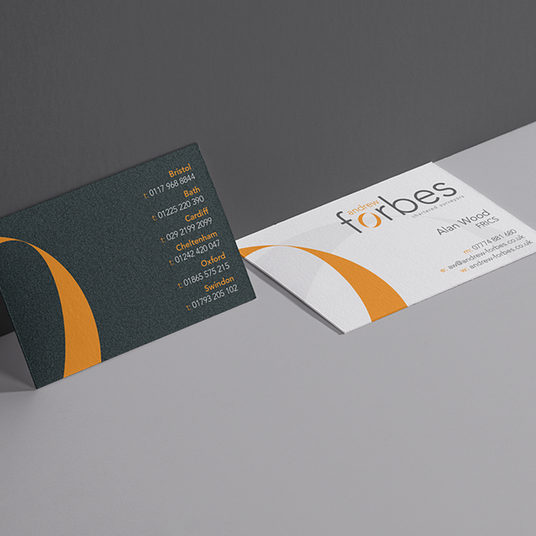
Additional to that, we updated the existing colour palate to something far more striking and bold, but still business-like. This new look, which included new typography and graphical elements, have then been rolled out in to all customer facing materials and signage. The new materials are now more modern, professional and importantly impactful. They certainly represent the client much better, lending credibility to the whole brand.
“We have implemented the branding across the practice and I must say we are incredibly pleased with the look – it has elevated the product far beyond our expectation.” David Chichester – Andrew Forbes
The Outcome
The result of these decisions and hard work has been hugely rewarding both for us at Caffeine, but more importantly for the client. They have felt a real lift in their own confidence in their branding, and the change hasn’t gone unnoticed by their own clients with numerous positive responses.
Contact us to chat about your website or other design needs, we’d love to chat.